CiderExpert.com
The Problem: CiderExpert.com is a crowdsourced website that provides information about hard ciders and cideries around the globe. The website has 100 active visitors and 5 - 10 active users. CiderExpert.com wants to increase user engagement and provide an experience that is simple, fun, and informative.
The Solution: Create a mobile responsive site for Ciderexpert.com, including a redesign for the current desktop version. The new site will allow users to seamlessly search for and rate ciders, "boozemark" ciders for later and receive recommendations of ciders that match their unique taste profile.
Client: David Sielaff, founder of CiderExpert.com
Team: Nicholas Draney / Teresa Liu / Yonas Berhe
My role: Information Architect / User Researcher (team collaboration) / Visual Designer (Desktop only, with Nicholas)
UX Tools: Illustrator / Photoshop / Omnigraffle / Usertesting.com / Sketch / Invision
User Research
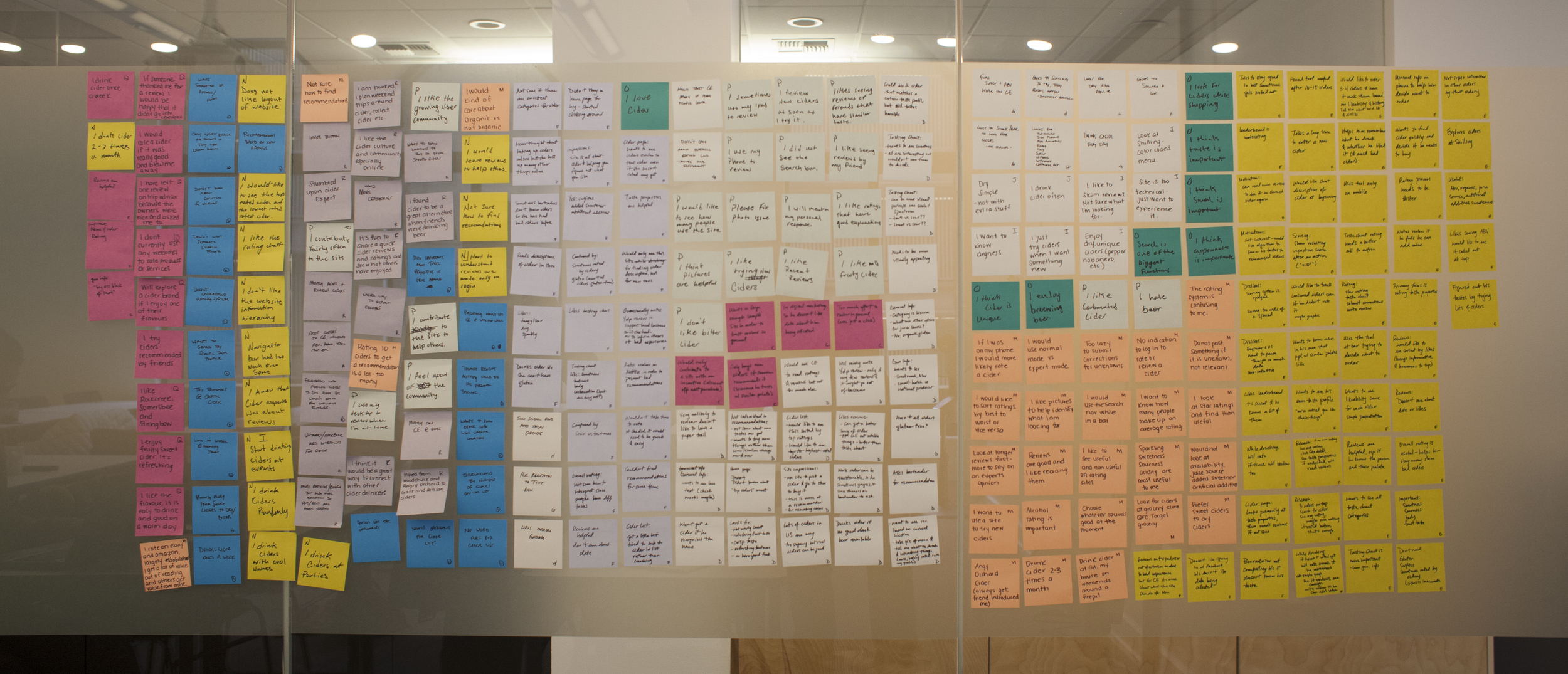
My team and I began our research phase by conducting interviews with existing and non existing users of CiderExpert.com. We emailed, skyped, took calls and met with hard cider fans across Seattle. We even took up residence at 4 different cider bars in Seattle to interview their patrons and management.
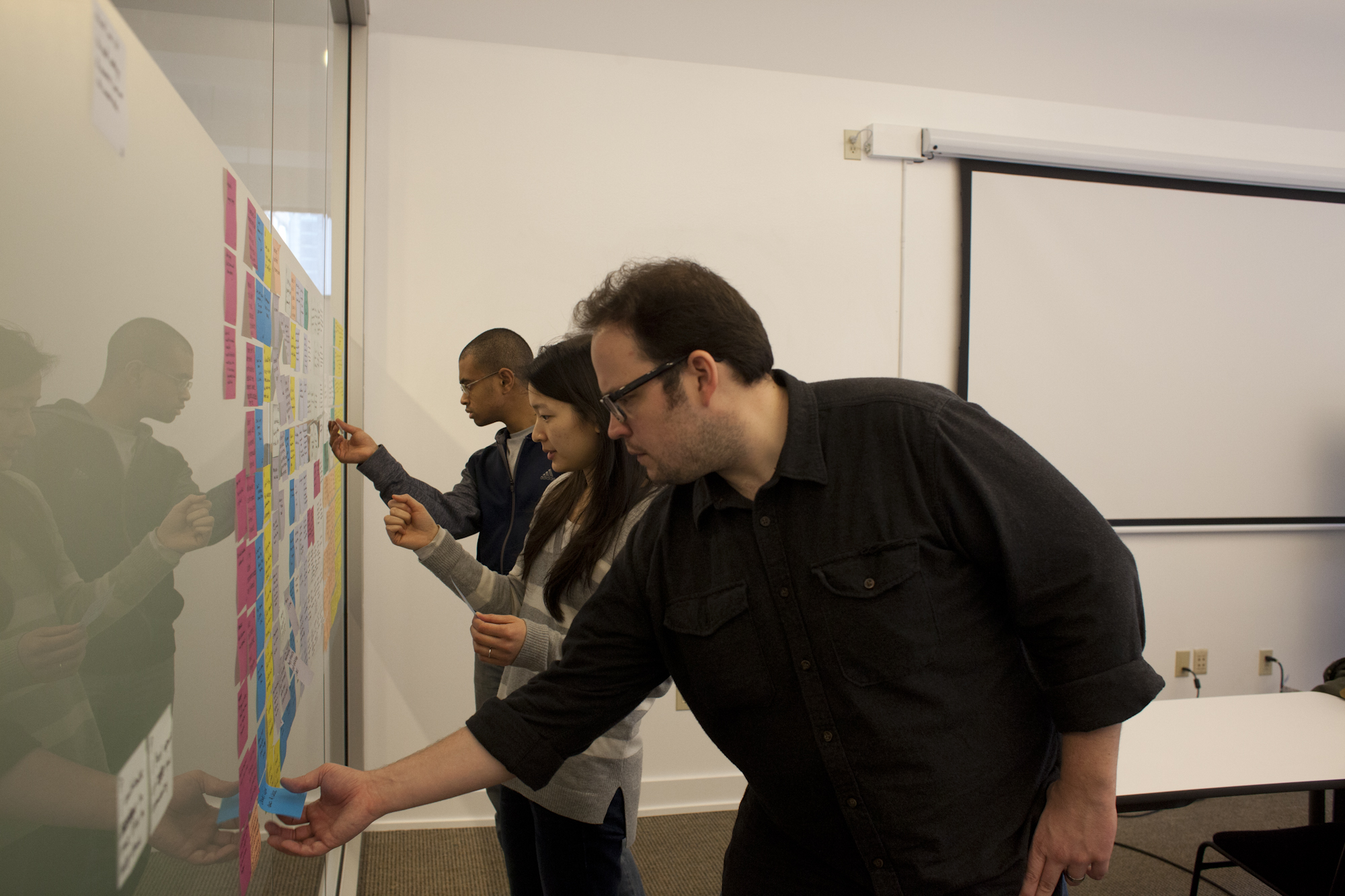
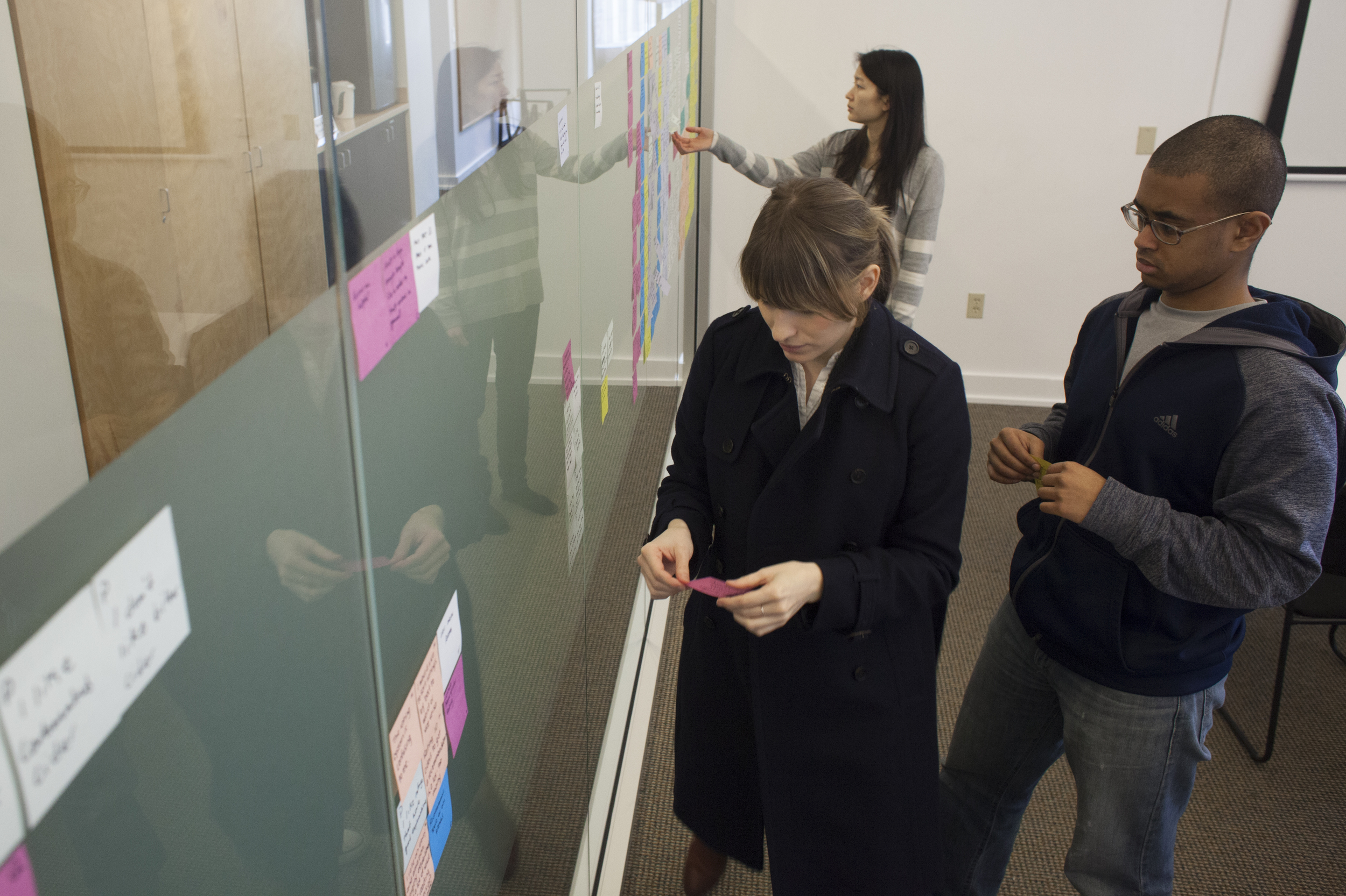
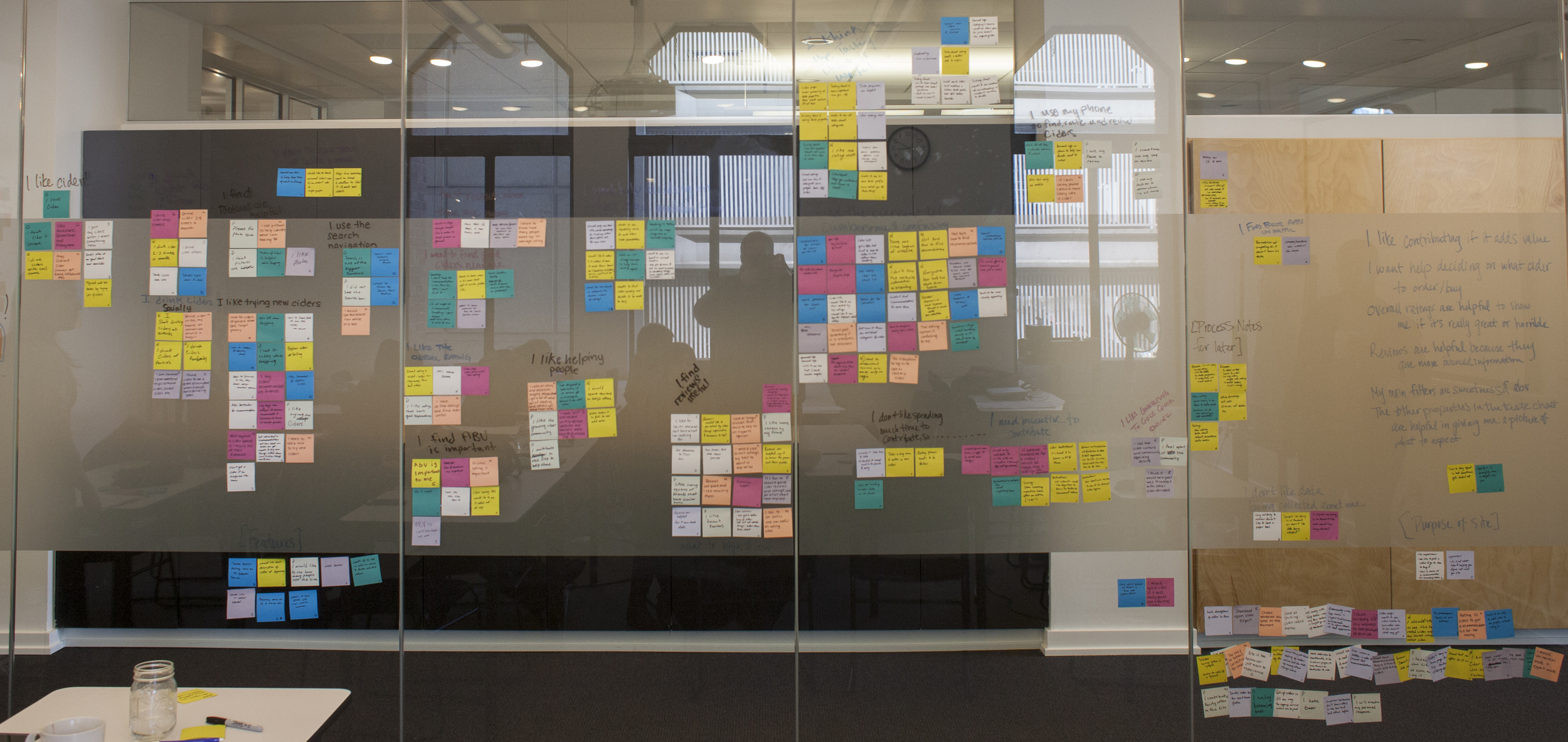
Affinity Diagram
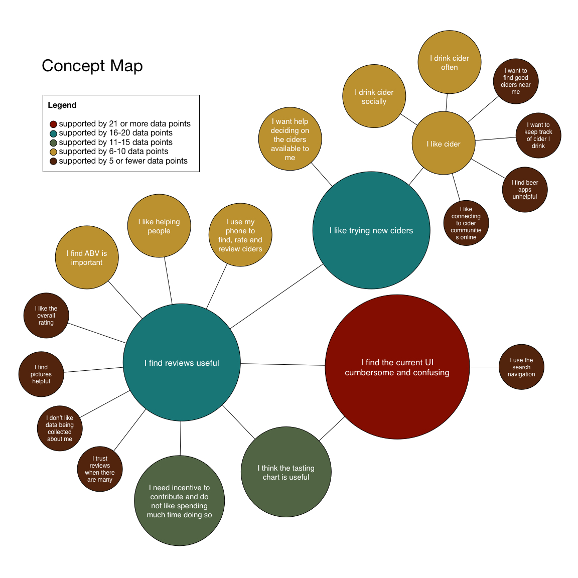
Concept Map and Persona Hypothesis
After establishing our users behaviours, pain points, goals and requirements we were able to flesh out our persona hypothesis. Building a concept map not only helped determine our persona hypothesis but also provided insight as to how to structure the new design.

Storyboard
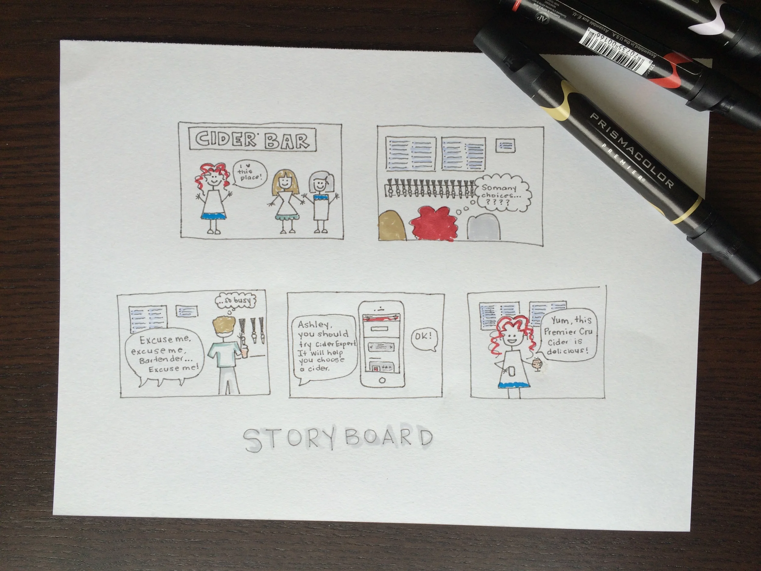
Our team developed multiple scenarios for our persona. After reviewing our initial research, we came to the conclusion that the scenario depicted below was the most common occurrence for our user.
Design Sketches
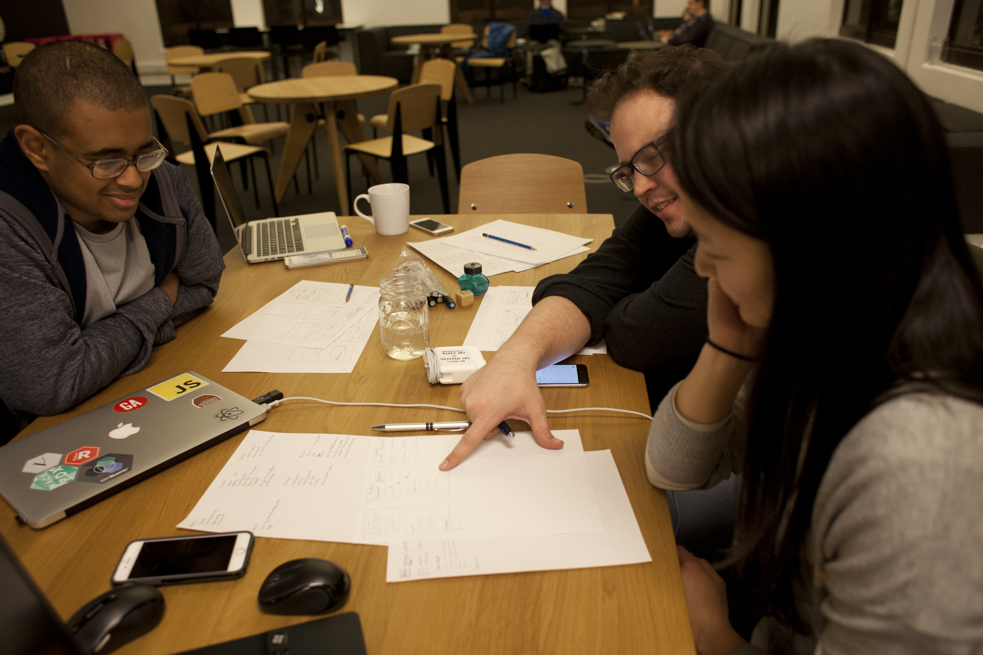
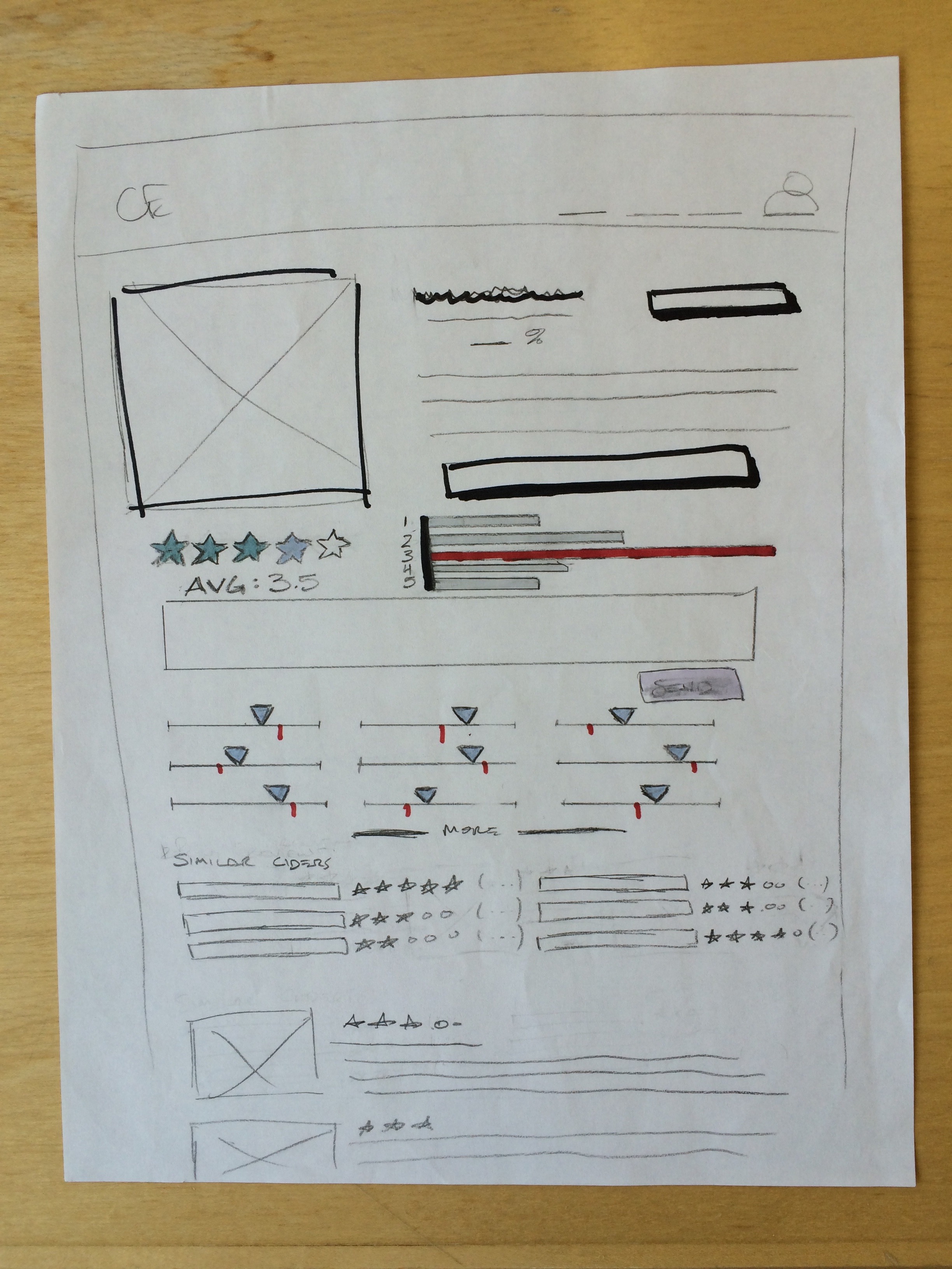
Our team collaborated on the design sketches. We would begin with choosing a feature/process of the site and then each team member would have 5 minutes to illustrated what that may look like. Afterwards, the designs were critiqued and discussed. This process continued until we agreed what would satisfy our user best.

User Flow
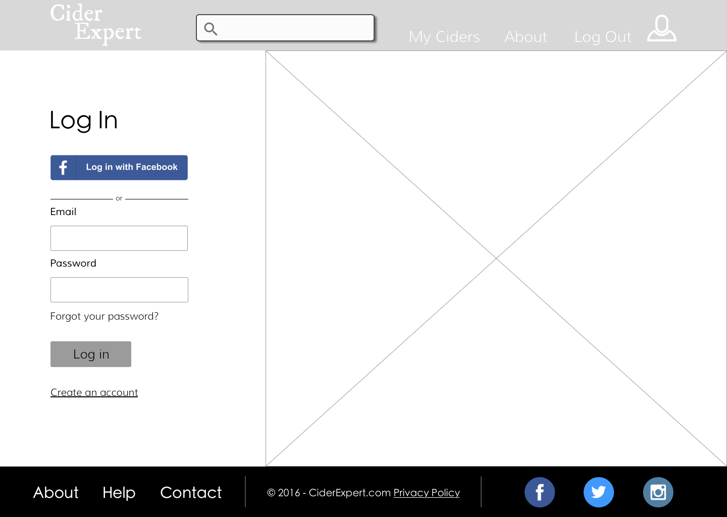
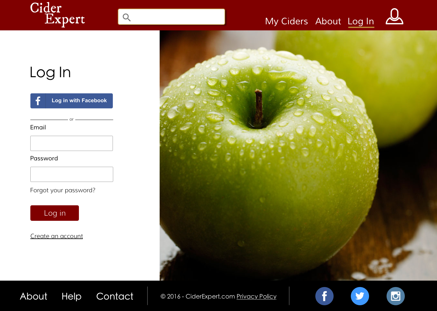
After sketching out various screens, our team had a better understanding of how the user would interact with the site. A clear path was determined including the process of logging in, searching for a cider and rating a cider. We kept each process simple with as little clicks possible.
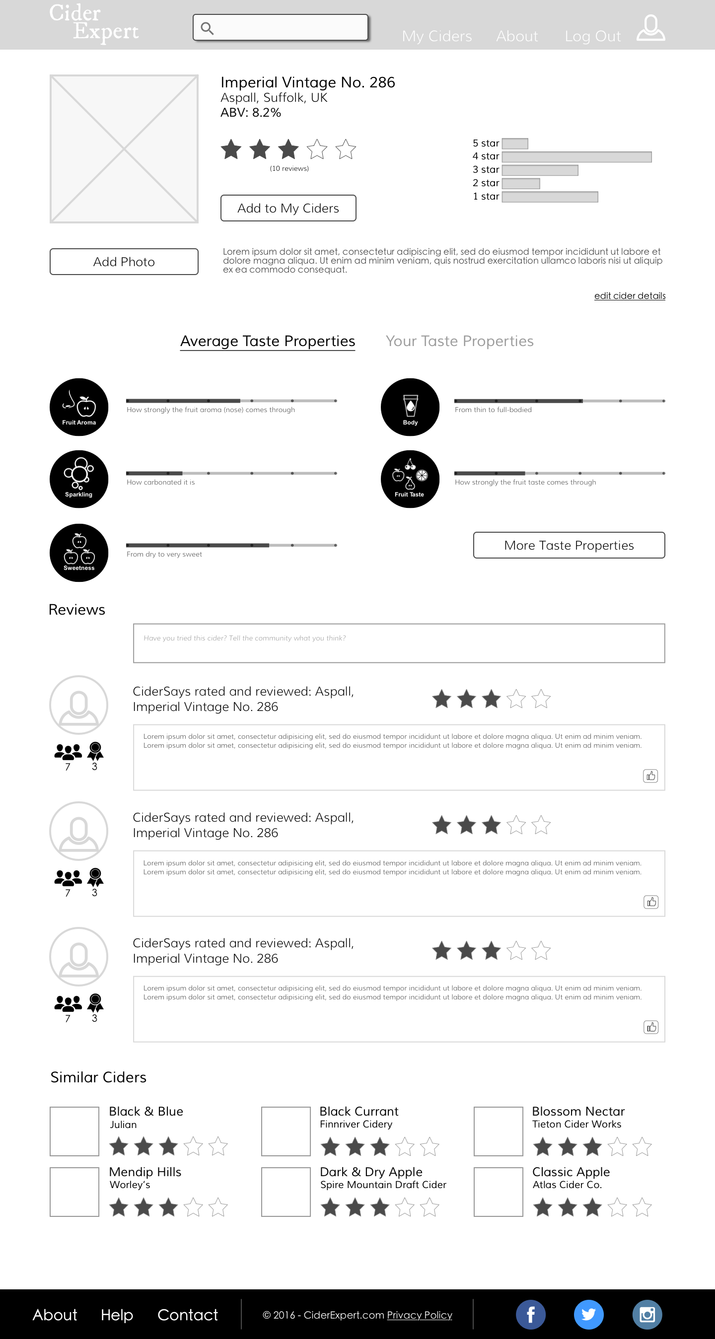
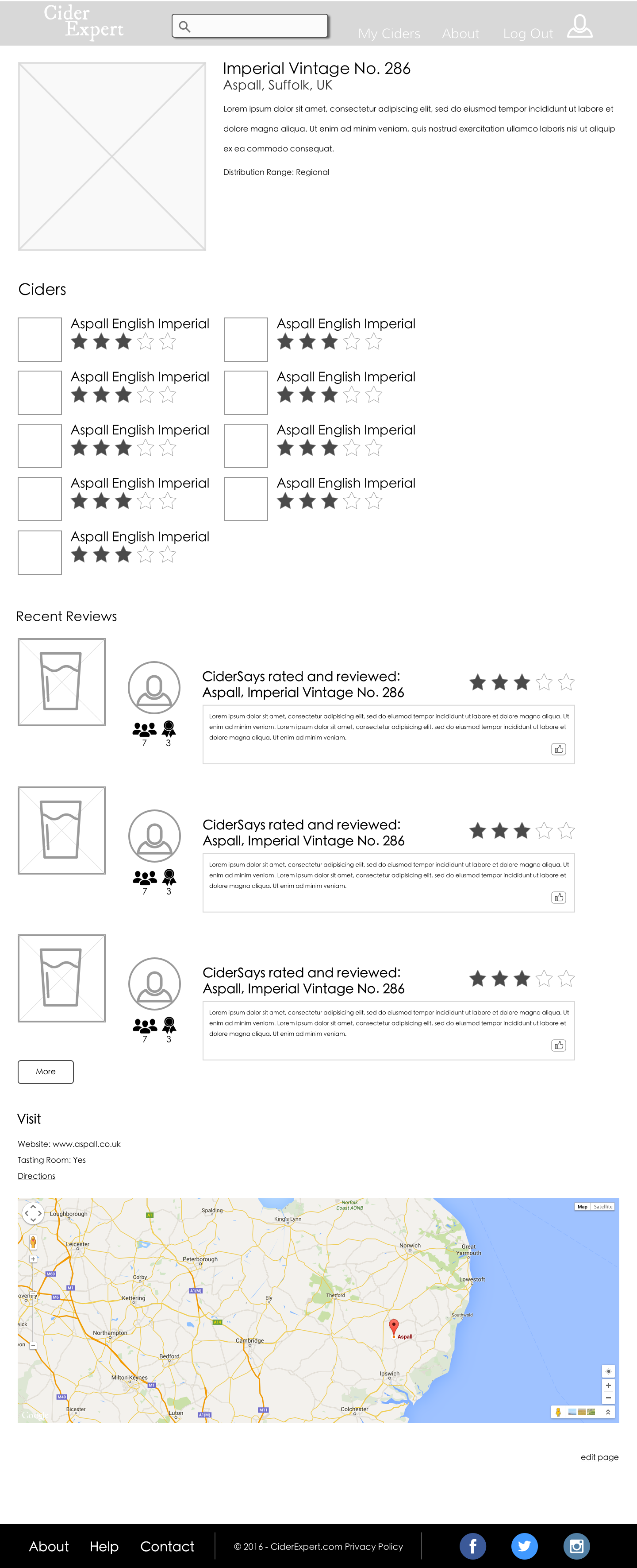
Wireframes (Key Desktop Pages)
Usability Test Findings
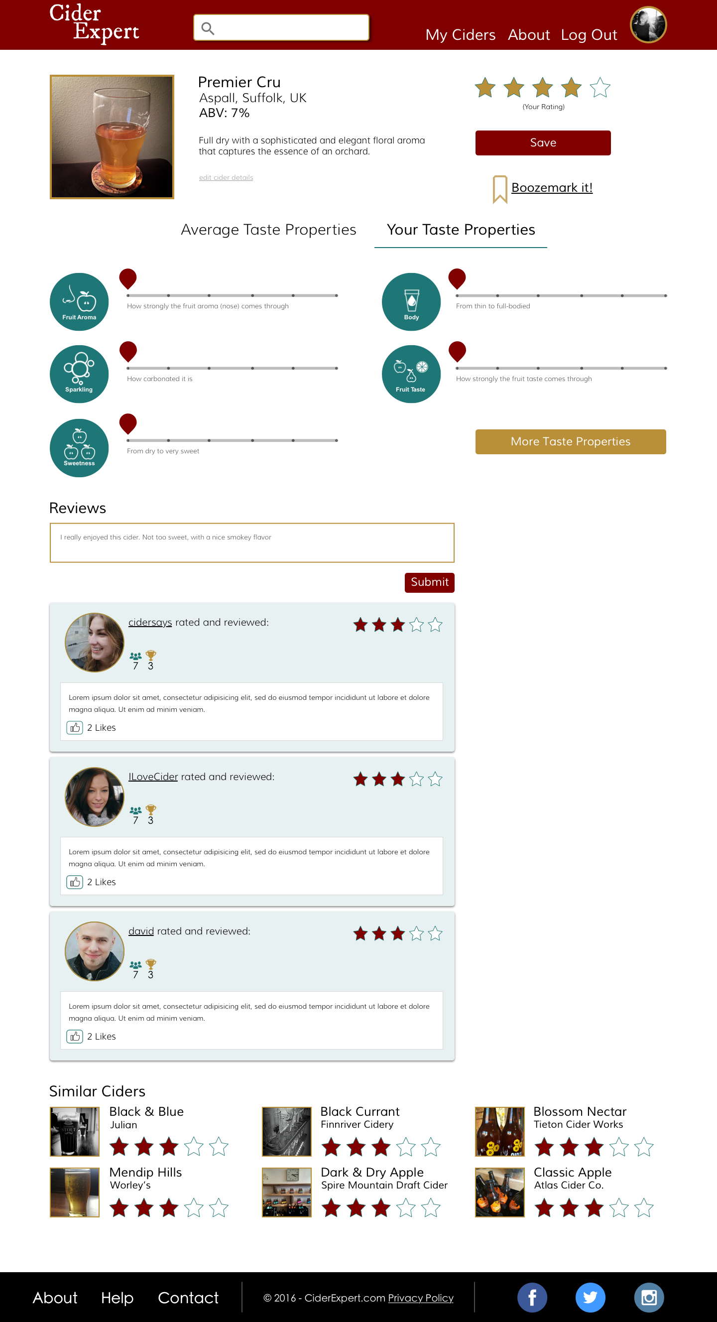
Each team member conducted multiple usability tests that took users through the clickable wireframes for mobile and desktop. We tested mobile in person and desktop using usertesting.com. Afterwards, we assembled back together and discussed our findings. It was clear that our users really liked the cider page and it's new features. However, they were having difficulty understanding how to save their ratings.
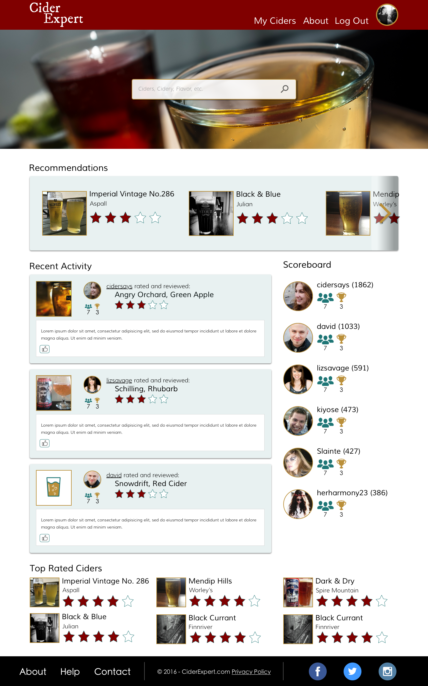
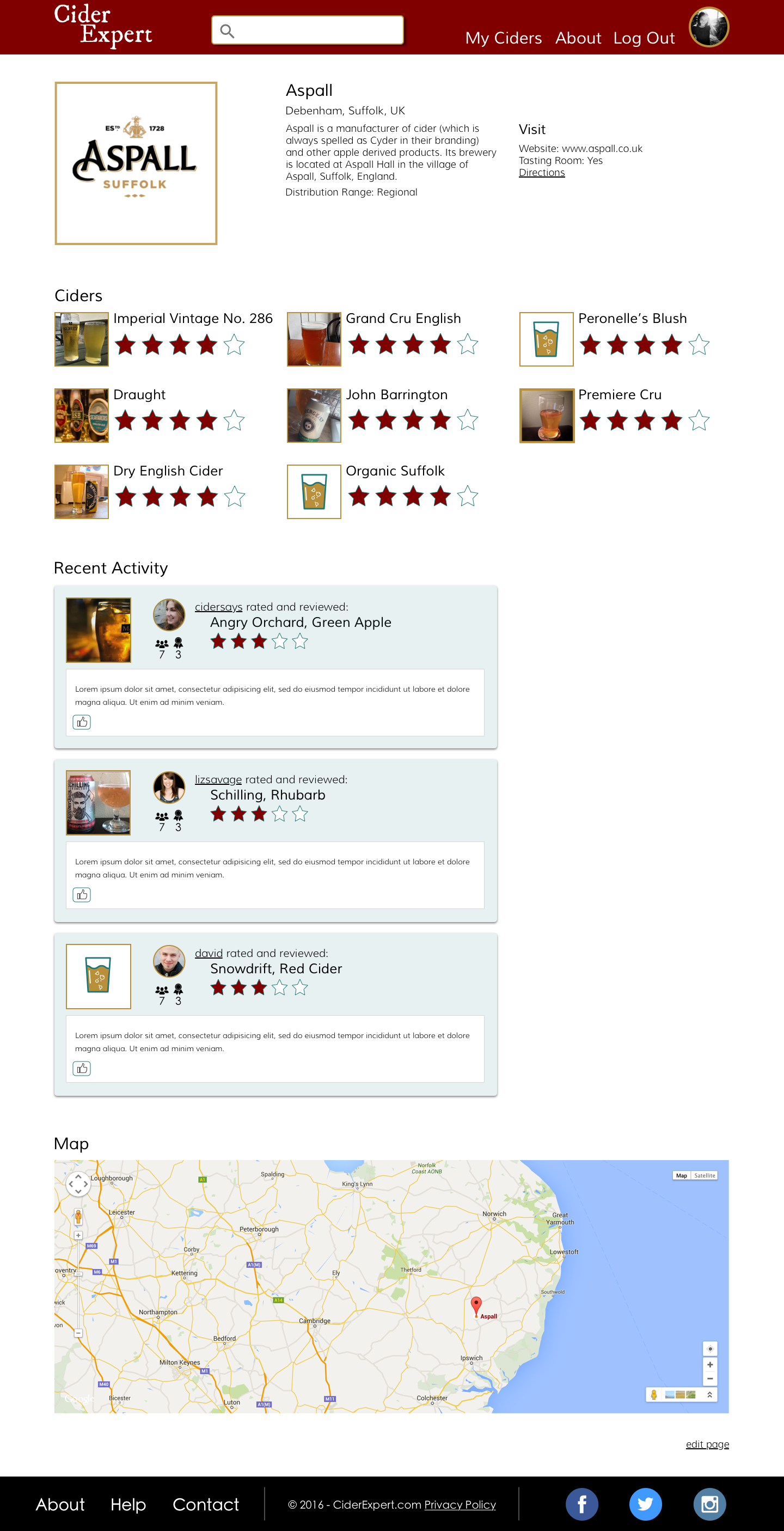
High Fidelity Screens
Before/After Testing
Out of the 12 testers, 10 testers preferred the redesign either by verbal confirmation or as shown by their ratings. The two testers that preferred the current site design preferred it because they wanted to see the extended general information details that were removed in the redesign.
Before and After Testing Results
Future Features
Future features that were determined from our original research findings.
Location services - specifically where people can find certain ciders near them
Image/barcode recognition to quickly find ciders
Filter and sorting of search results by ABV, country, region, etc.
Rankings for ciders/cideries
"Likeability" score
Recommend cider to a friend
Discussion board


