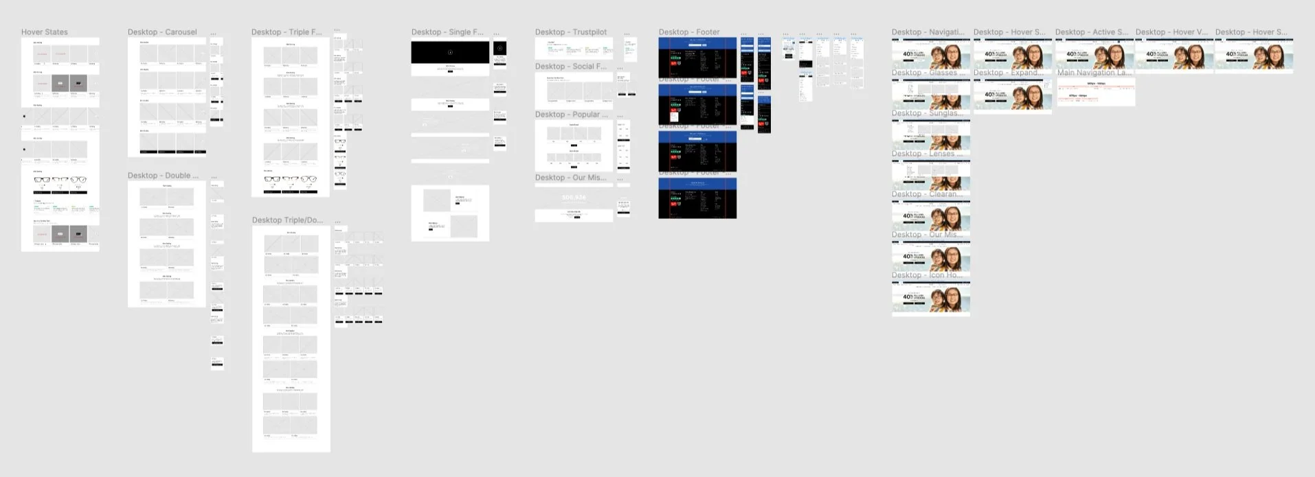
Clearly Glasses Homepage Optimization
The Project: To increase engagement and conversion rates, improve the glasses homepage by following the latest branding guidelines, incorporating the product team's strategy, and utilizing UX research findings.
My Responsibilities:
Conduct comprehensive user UX research, including heuristic evaluation, competitive analysis, heat map analysis, and implementation of best practices for homepage and category navigation based on insights from the Baymard Institute.
Create designs that are responsive on both desktop and mobile devices, including wireframes and high-quality mock-ups.
Produce completed creative materials that align with the company's strategy and promotional schedule.
Implement the finalized designs in Adobe Experience Manager utilizing HTML, CSS and JavaScript.
Perform user acceptance testing to check for any page bugs or design inconsistencies using the finalized mock-ups.
The Challenges: The project initially included optimizing the global navigation but this was descoped due to a lack of resources available from the engineering team.
Heuristic Evaluation & Baymard Institute Guidelines Review
I initiated my research by performing a heuristic evaluation to assess the usability of the homepage. The evaluation revealed several key findings that needed attention. Firstly, there was a lack of hover states, which affected the user experience by not providing visual feedback when interacting with elements. Secondly, I identified accessibility issues stemming from low contrasting colours, which could pose challenges for users with visual impairments. Additionally, the homepage did not effectively communicate the geographic location to customers accessing the website on mobile devices.
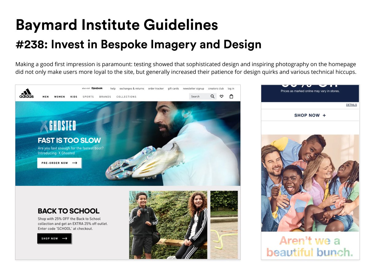
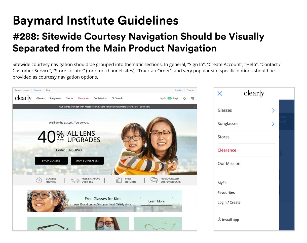
To further inform my design approach, I consulted the homepage and category guidelines established by the Baymard Institute. These guidelines offered valuable insights and design strategies related to navigation categories, page imagery, product features, and the search field. Incorporating these recommendations was instrumental in enhancing the overall design of the homepage.
Competitive Analysis
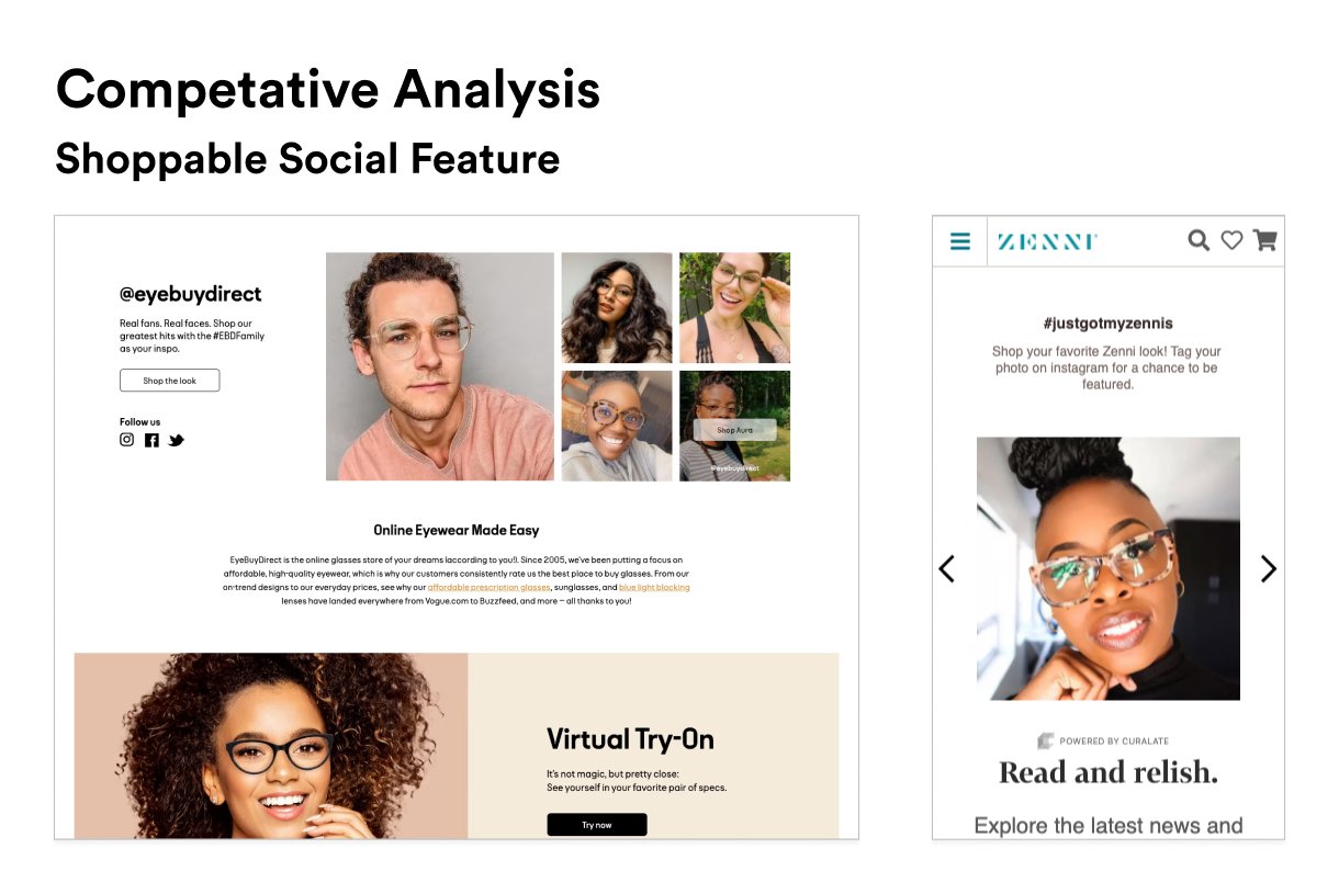
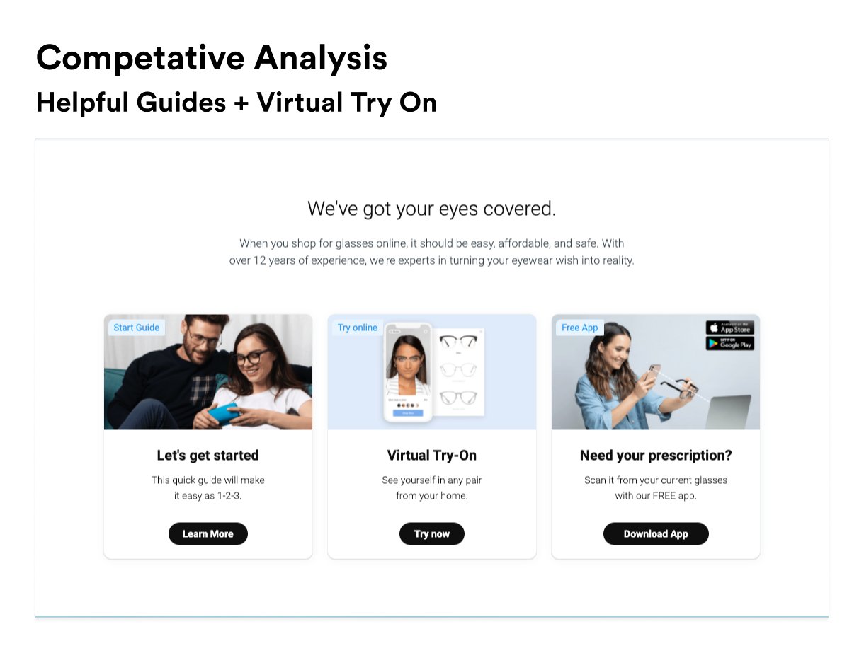
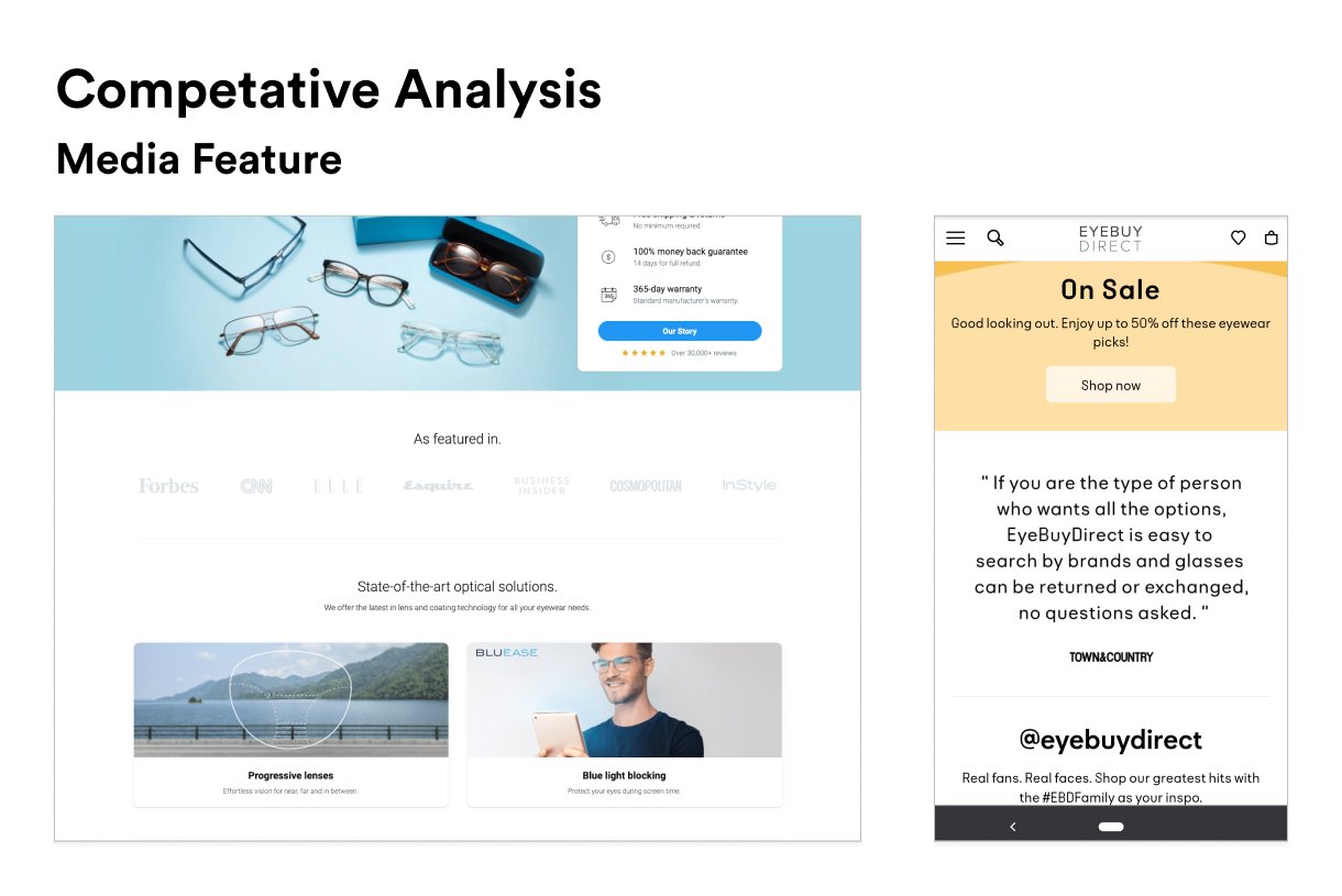
In order to gain a comprehensive understanding of the competitive landscape, I conducted a thorough analysis of Clearly's primary competitors. This analysis focused on reviewing their global navigation, homepage content and hierarchy, and the accessibility aspects of their designs. By examining the competition, I could identify industry best practices and potential areas for improvement.
Heatmap Analysis
To gauge user behaviour and interaction patterns, I conducted a heat map analysis of Clearly's glasses homepage. This analysis involved tracking the click rate and scroll rate of the page, providing valuable insights into which areas received the most user attention and engagement. These findings were instrumental in identifying potential optimization opportunities for the homepage.
Project Brief
After conducting preliminary research, I organized a meeting with project stakeholders to deliver a comprehensive project briefing and present the findings from my research.






Initial mock-ups
Utilizing the insights gathered from my research, I developed initial mock-ups that covered desktop and mobile designs. These mock-ups incorporated essential elements such as the global navigation, promotional content, educational content, social content, the footer navigation, and an annotated page highlighting hover states.
Once completed, I presented my designs to the UX team for feedback and incorporated their insights. Subsequently, I presented the mock-ups to the project stakeholders for review and approval.
Components and Prototype
Once the initial mock-ups received approval, I commenced the development of desktop and mobile prototypes. After completing the prototypes, I scheduled another meeting with the UX team to present and discuss the prototypes, seeking their valuable feedback. Taking their input into consideration, I made necessary refinements to the prototypes.
Following the refinement phase, I proceeded to present the prototypes to the project stakeholders for their final review and approval. Their insights and feedback were instrumental in shaping the prototypes and ensuring their alignment with project objectives and requirements.
Project Descoped, Navigation Optimization Adjustments Required
Due to limited resources in the engineering team, the project had to be descoped. However, the marketing team expressed a strong desire to proceed with the optimization. Consequently, the project was rescoped without the involvement of the engineering team. As a result, I took on the responsibility of page development. However, the designs needed to be adjusted to remove the navigation optimization since implementing those changes would have required engineering support.
Updated mock-ups
I eliminated the navigation optimization from the designs and revised the mock-ups to incorporate essential subcategories within the body of the homepage. By featuring these key subcategories as homepage content, we aimed to enhance the convenience of our customers in finding specific products they were seeking. In addition, I included a skinny banner in the revised designs to highlight Clearly's value propositions. This specific addition was a request from the CEO, who wanted to incorporate them into the updated designs.
The updated mock-ups were shared with the UX team for their feedback and input. Following their review, the revised designs were presented to the project stakeholders for their final approval.
Implementation
Before proceeding with the implementation, I conducted meetings with the e-commerce team and the copy team to align on the content to be showcased on the glasses homepage during the launch phase. Following these discussions, I focused on developing the necessary creative assets for the page.
Once the final copy and creative assets received approval, I commenced coding the page in Adobe Experience Manager. After completing the development process, I moved the page to the staging environment for finalization. In this stage, I arranged a User Acceptance Testing (UAT) session to thoroughly test the page for any bugs or design inconsistencies.
Upon successfully completing the UAT and addressing any identified issues, the finalized designs were published on the live site, making them accessible to users across all targeted geographies.
Next Steps
Initiate a heatmap analysis using Hotjar to assess the click rate and scroll rate of the page. Simultaneously, review the click rate of all datalinks on the homepage through Adobe Analytics.
To further optimize the homepage, conduct A/B testing using Adobe Target. Experiment with different content variations and content hierarchy to evaluate their impact on user engagement and conversion rates.


