Clearly Website Migration
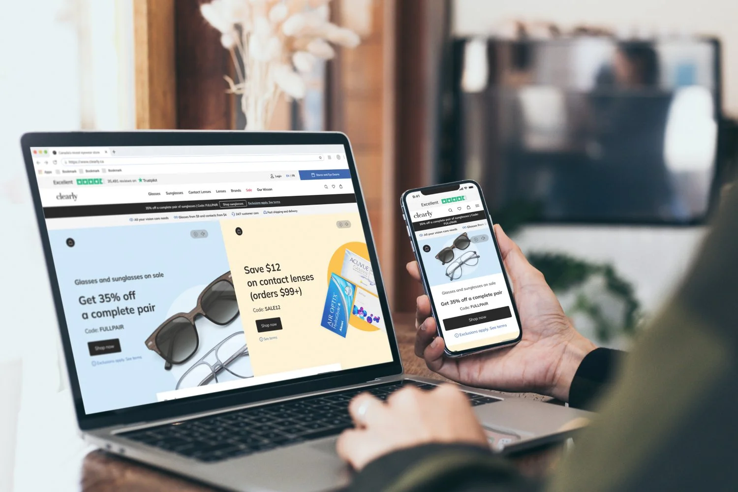
The Project: As part of the digital platform consolidation initiative at EssilorLuxottica, Clearly has been mandated to transition from our current platforms to EssilorLuxottica's digital infrastructure. The Clearly UX team has been assigned the responsibility of migrating our existing design system and web experience to align with EssilorLuxottica's brand standards. The goal is to streamline EssilorLuxottica's overall digital presence and elevate the user experience across all platforms.
My Responsibilities:
Updating the design system
Updating the Lens Configurator
Updating the Checkout and Thank You pages
Updating the My Account section
Creating static page templates, including Lens Product Listing Pages
Creating image assets
Develop copy templates and plug the finalized copy into the mock-ups
Conducting User Acceptance Testing (UAT) to ensure functionality and quality assurance.
The Challenges: The majority of templates initially provided by the EssilorLuxottica team were found to be incomplete. However, this presented a valuable opportunity for my team to reconstruct and enhance these components by adhering to Figma best practices. By doing so, we ensured that the rebuilt components would be more adaptable for future iterations and modifications.
Design System
The project kick-started by implementing atomic design methodologies in the design system. Initially, the EssilorLuxottica design team shared a preliminary version of the system, which served as a starting point. Subsequently, my team collaborated to refine and align the documentation and components with Clearly's brand guidelines.
During this process, my primary focus revolved around the atoms, which are the fundamental building blocks of the design system. Additionally, I dedicated attention to enhancing the CMS modules, streamlining the navigation system, and optimizing the store locator feature.
Lens Configurator
The lens configurator is a dynamic and user-friendly flow that empowers users to input their prescription details and make well-informed decisions when selecting lenses that cater to their specific requirements. To enhance the configurator, I initiated my work by carefully examining and mapping out the existing flows, aiming to gain a comprehensive understanding of the user journey.
Moreover, in close collaboration with a subject matter expert (SME), I thoroughly assessed the complete range of lenses available for both single vision and multifocal prescriptions, ensuring that the configurator encompassed the entire assortment. This approach allowed me to streamline the user experience and facilitate accurate prescription input, enabling users to confidently choose the lenses that best suit their needs.
EssilorLuxottica initially provided foundational components for the lens configurator. However, recognizing the need to enhance and optimize the configurator, I took the initiative to rebuild the existing components while also introducing additional components to cater to the diverse user flows.
Through this iterative process, I ensured that the components were not only visually appealing but also highly functional, aligning with best practices and user-centered design principles. By incorporating additional components, I aimed to address specific user needs and enhance the overall usability and flexibility of the configurator.
After finalizing the components, I proceeded to create mockups for the lens configurator, encompassing a wide range of user flows. This included designing the flows for single vision, single vision sunglasses, reading-only glasses, progressives, blue light protection, bifocals, and non-prescription lenses.
In addition to the primary user flows, I also accounted for various error states that a user may encounter when entering their prescription. By considering these scenarios, I aimed to provide clear and user-friendly error messages, guiding users toward resolving any issues effectively.
Alert messages (applicable to new and saved prescriptions)
To ensure a smooth and cohesive experience for all users, regardless of their account status, I created detailed mockups that effectively demonstrated the contrasting experiences of logged-in users and guests without any saved prescriptions. The primary aim was to provide a seamless journey that catered to the unique needs of each user group.
Get prescription from your account flow
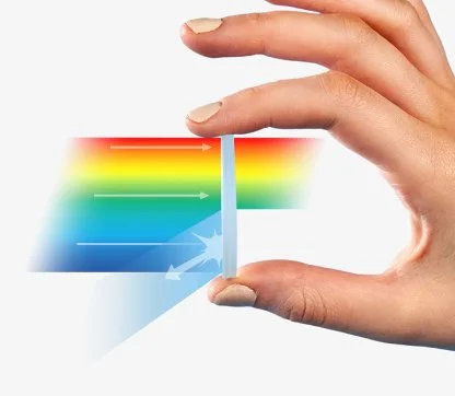
Once the different flows were finalized, I closely collaborated with a subject matter expert (SME) and a copywriter to develop educational modal windows. These modal windows were designed to serve as supportive tools for customers, enabling them to gain a comprehensive understanding of the available lens assortment.
Educational modal windows
Checkout and Thank You pages
Similar to the lens configurator, the checkout process began with EssilorLuxottica providing foundational components. However, I recognized the importance of enhancing and optimizing the checkout to accommodate Clearly's unique features, such as the buy one give one program, shipping calculator, and a variety of payment methods. To achieve this, I proactively undertook the task of rebuilding the existing components while introducing new ones specifically tailored to support these additional features.
Buy one, give one mock-ups
My Account
In close collaboration with the UX manager, we took on the task of optimizing the original My Account designs by introducing new components that effectively accommodated various customer-centric features. These enhancements were specifically focused on streamlining processes such as customer direct billing claims, saved prescriptions, and the contact lens AutoRefill feature.
Lens Product Listing Pages
The lens product listing pages are thoughtfully designed as shoppable educational pages that provide comprehensive information about different lenses. These pages serve to explain how each lens type works, highlight their various use cases, outline their limitations, offer comparisons to other lenses, and guide users on how to order them through the Clearly website.
To ensure the effective communication of these lens options, I collaborated closely with a subject matter expert (SME) and a skilled copywriter. Working in tandem, we carefully crafted the visual and descriptive aspects of the lens product listing pages.
Image Asset Creation
Given the ongoing focus of Clearly's creative team members on promotional content for the website, stores, and performance marketing, the responsibility for creating all educational and evergreen content on the website fell to the UX team. In light of this, we took on the task of developing the necessary content to ensure a comprehensive and informative user experience.
Final copy
In close collaboration with the developers and the copywriting team, I played a key role in developing a standardized template that could be adapted by the copywriting team for various content on the website. This template provided a consistent structure and format, ensuring efficient content creation and maintenance.
Additionally, due to resource limitations, I supported the copywriting team by assisting in the creation of copy decks for specific sections such as the lens configurator, lens product listing pages (PLP), and various static pages. This involved collaborating with the copywriters to develop compelling and informative content that aligned with the overall website strategy.
Furthermore, as part of the UX team's responsibilities, we took charge of seamlessly integrating the finalized copy into all mock-ups before handing them off to the development team. This involved meticulously placing the copy within the designs, ensuring a cohesive and engaging user experience.
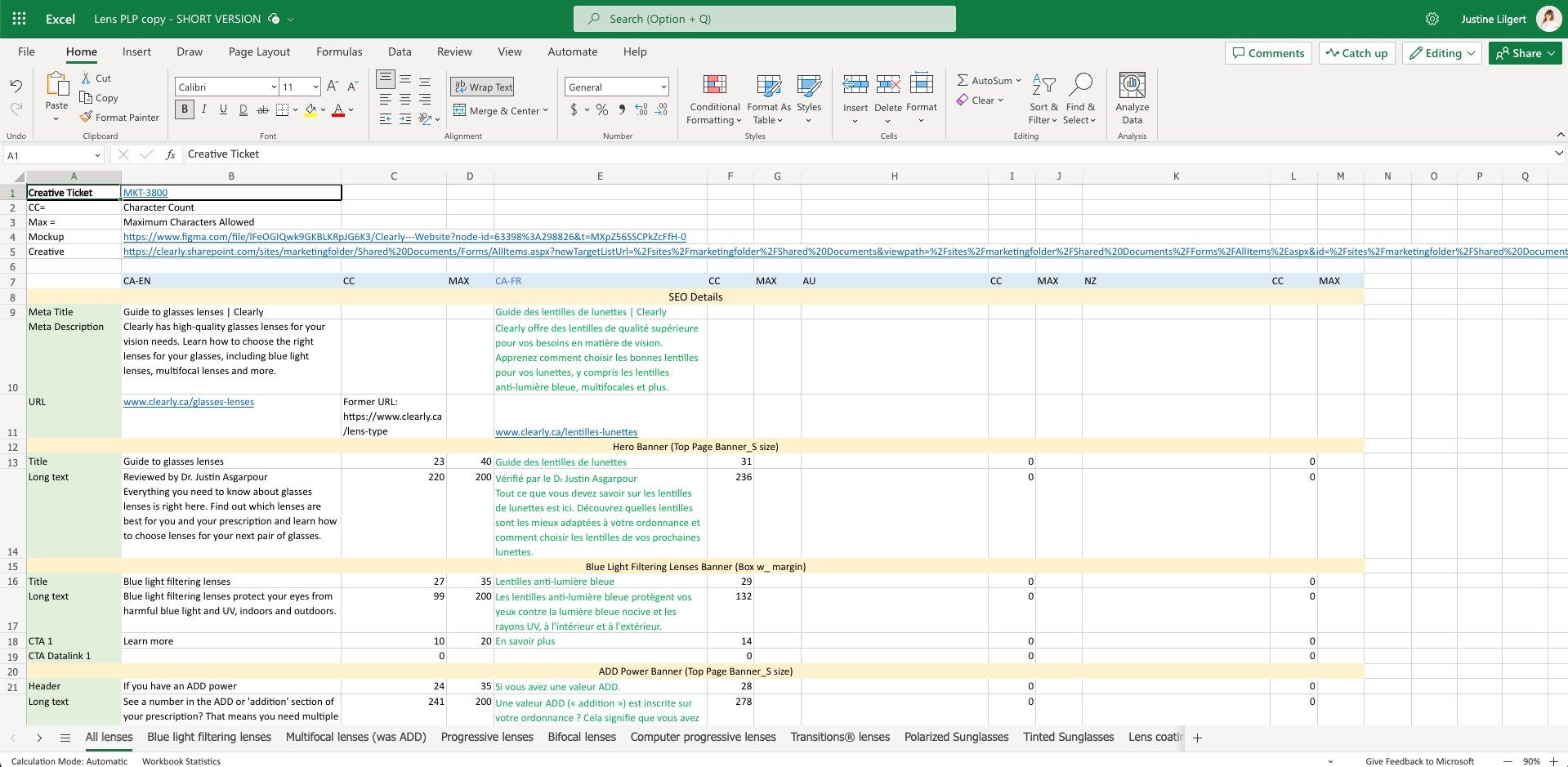
Lens product listing page copy deck
User Acceptance Testing
In order to maintain consistency with the mock-ups, ensure functional integrity, and uphold quality assurance standards, the UX team played a crucial role in supporting the user acceptance testing (UAT) phase of the newly developed Clearly website. During UAT, we actively participated in testing the website's features and functionality from a user experience perspective. This involved closely examining the implemented designs, evaluating the user interactions, and verifying that the website operated smoothly and met the intended objectives.
Next Steps
Conduct usability testing to gather user feedback and identify areas for improvement.
Migrate the Clearly blog to the website for a unified online presence.
Revisit and address designs that were descoped for the initial launch, ensuring they align with the overall vision and goals of the website.


